Color is a subjective experience*. While we can be reasonably sure that when you and I look at, say, The Starry Night, we’re seeing the same field of variegated blues with pale yellow stars, rich canary moon and rolling blue hills, we’re never entirely certain. However, while whether you and I experience orange in the same way is a question without either an answer or any action whatsoever to take attached to it, what is interesting is creating colors that match, and in particular, creating colors that match across fixtures.
This is of particular importance in entertainment lighting scenarios, where we often (usually, even) have lighting fixtures that are vastly different across manufacturers. Within that ecosystem, there might be different color modes or curves that affect the values that we use to create relatively identical colors, that is, colors that match between fixtures. Because having two or three different oranges or pale greens in a scene would be distracting, great care is taken by good lighting designers and programmers to match colors between fixtures at the outset of a tour or a show, to ensure that colors that should match, do.
Often, programmers use their first lighting group and match everything else to that, or choose the fixture with the most possible colors and use that as a reference. This is all well and good, but it was this sort of ad-hoc color matching together with a macro I was working on the other day that got me wondering – is there a way to create matched presets somewhat objectively, with a particular reference on having things evenly-spaced around our color space, but also making sure we hit the “pure” hues our lights are capable of along the way? What I mean here by “objectivity” is that we’re choosing colors based (largely) upon consistent spacing around the color wheel, and not just picking hues off a chart, or by name out of a gel swatchbook.
What got me thinking about this was two separate issues. The first was some updates that I needed to do to my color generator macros: I had ColorForce IIs on a show, and had them in RGBA mode. Neither of my macros will correctly create colors for these fixtures that also use the amber emitter correctly. The other fact that captured my attention was opening someone else’s showfile and seeing a trick that a lot of programmers do, which is to leave bagzillions of fixtures loaded into their showfile, unpatched, so that their presets stay. There is actually a grandMA feature that exists so that you don’t have to do this, called Reference Presets, but nobody uses it for some reason – and it got me thinking about creating a library of somewhat calibrated fixture presets based on, well, some amount of math.
This immediately raises some interesting questions about the nature of color. As a framework, I like having a macro that gives me fifteen hues and five tones. Why? Well, because this corresponds nicely to the number of available preset objects available in the size of my colors preset window in my default show file. And at some point, we have to decide on a number of hues, and that number will more or less be arbitrary. So fifteen is a fine number.
We therefore need to choose fifteen reference hues, and here we are forced to make some philosophical choices about which colors are “best”, and this presents difficulties. First, there is an elegance to creating a preset based on absolute values, not a color. In the case of a CMY fixture, the “reddest” you can get it is to set your (M)agenta and (Y)ellow values to 100%. However, with many fixtures, this won’t create anything as close to red as the pure red you get from LED fixtures with only the red emitter on. It’s a theoretical red, but from the standpoint of our eyes, it might be better classified as “orangey red”. Should we have a reference hue just for that, or is it good enough to store LED “pure” red and this orangey red we get from CMY systems in the same preset? And so on, and so forth. Where we’re headed – if we’re not careful – is a mismash of “exception” presets – presets that we make because some fixtures aren’t good enough to create perfect reds or the right greens. Besides, who’s to say that the blue we get from a Viper or the magenta we get from some Chauvet fixture is the “correct” one, anyway? Even a minor delve into the color science of this issue leads me to believe – very quickly – that attempting any sort of scientific objectivity with regard to color is going to be basically impossible, at least given my understanding of color spaces and systems.
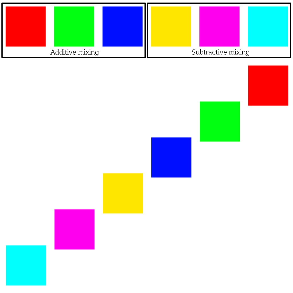
Another strategy we could consider would be to pick a reference illuminant (5600K) and a series of gels, and match to those. The problem with this tactic is that it forces extra reference materials into the equation, and I’d prefer to derive the colors from one or two single reference fixtures, or from math only. And besides, scientific objectivity isn’t what I’m aiming for in an entertainment scenario, anyway. What matters to me, I think, is a system where we start out with fifteen hues that go around the color wheel, and – to start out with – basing those on the six “pure” hues that the two most common mixing systems can create. Perhaps it’s better if we show this with some pictures.

To start our system of reference tones, it makes sense to use the “purest” tones we can get. This means starting with these six, which have either the color flags all the way inserted, or a single LED chip on. Doing this gives us six “pure” tones, three from each fixture, and then we match the complimentary hues for additive (yellow, cyan, and magenta) to the pure hues for subtractive, and vice-versa.
Our base complete, now we have nine in-between tones to fill in. Here they are, plotted against our “primary” hues. Somewhat arbitrary spacing between the primary and secondary hues are, but hey, that’s the lighting life. 😉 If you were wondering how I first came up with these hues, grandMA made them for me based on fifteen evenly-spaced points along the 360º HSL wheel, which corresponds to 24º of separation. Seems an appropriate starting point.

Now the real difficulty is: determining where exactly those in-between colors should be, and what fixtures we should use to determine their values. And, in fact, we run into this even before this point, when we must choose which fixture to use for our starting colors (red, green, blue, and cyan, magenta, and yellow.) It’s more important for the subtractive colors than the additive ones, as most LED fixtures are using pretty closely-matched colors these days. So, what should our reference fixtures be? While the initial colors may be derived mathematically from HSL values, different fixtures are going to render those colors differently – the point of our exercise is that we want to create a library of reference presets that look the same (or as same-y as we can make them) from fixture to fixture.
This is a difficult question to answer, because different manufacturers have different formulas for the color of their glass – from the chrome-y yellow of HES fixtures to the slightly-too-amber yellow of older VL fixtures. And changes in the value of yellow or magenta will change where our secondary colors land, so things can get complicated quickly. Not only that, but what condition of fixture should we be considering? Set aside the issues that we already see with LED binning, one channel of the fixture running at a different voltage, or software updates, and consider subtractive mixing a moment. What color temperature source should we use? A Source4? That biases a particular direction. Which lamp? A new 750-watt HPL? Or a long-life lamp that’s 200-300 Kelvin warmer than standard? A MAC Viper? With how many lamp hours? How recently has the glass been cleaned? There are a hundred variables that will change our outcomes here. That said, we have to pick something.
Where I think I fall is not choosing a fixture at all. It’s too expensive to go buying a fixture to have on hand at all times for a project like this, which is mostly just the musings of a lighting designer with too much time on his hands. You know what I do have on my hands at all times? My laptop. That’s right: why not use the thing I pretty much always have on me as the reference point for creating my preset? Simply shine the light on a piece of white paper next to me, match the colors as closely as I can to the color on screen. Simple and elegant**. Let’s take a quick look at the original fifteen hues that were derived from the fifteen even steps around the color HSL wheel.
Due to the math, red, green, and blue end up perfectly on their respective RGB values, while cyan, magenta, and yellow are shifted slightly from where I’d put them. If we correct these three colors (to 60º, 120º, 240º), we get this:
In particular, this balances the yellow and the cyan, while it makes the magenta a little less red. The secondary colors stay at their 24º spacing. Now we can see these colors with decreasing saturation:
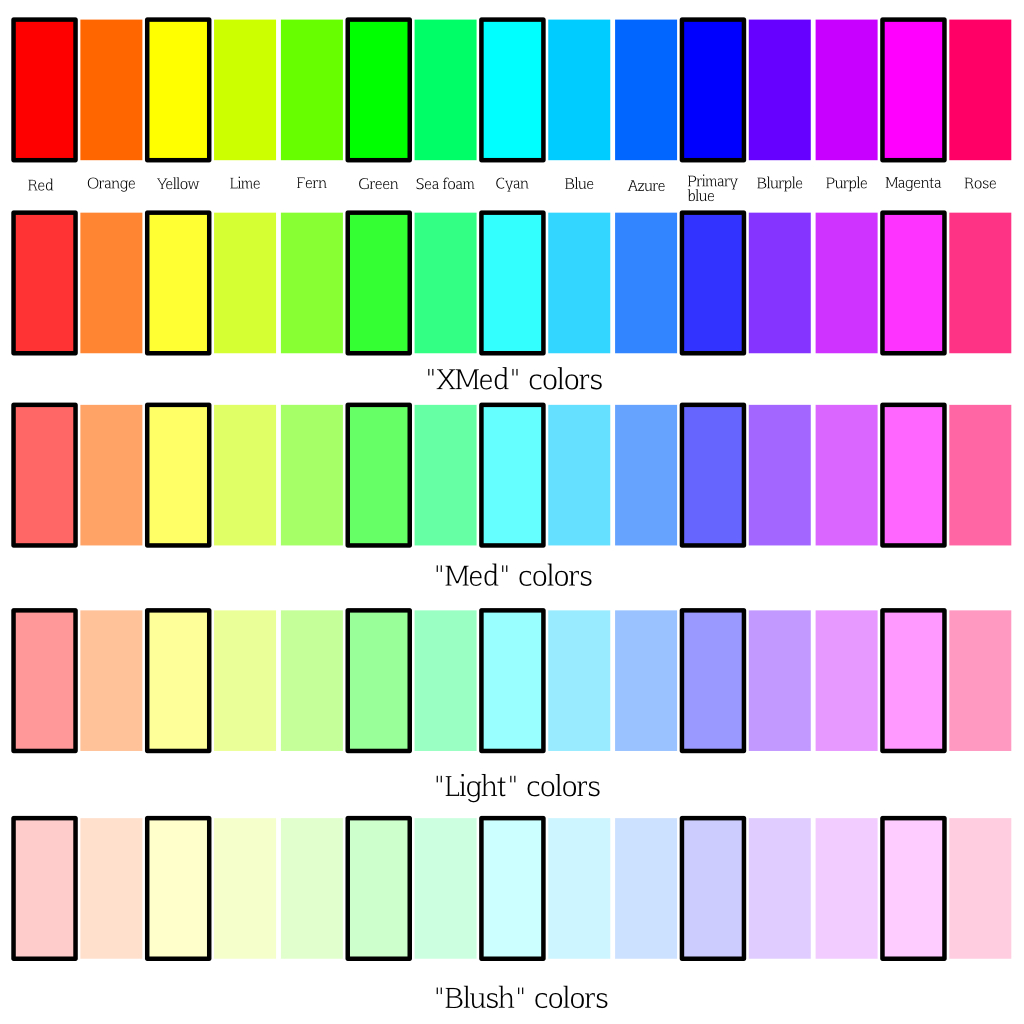
Each row is -10 points of saturation. Now, my Color Generator macro tries to get maximum brightness out of LED fixtures, so it uses the white emitter to try and get maximum brightness to decrease saturation. This is in generally a reasonable strategy, but it’s not perfect. But, the generator macro doesn’t care. Its job is to generate a palette of Global color presets that we can use for fixtures we haven’t seen before on a show. It’s our job to try and start matching fixtures that we run across, and while there are a fair number of presets here to work on, once we have the most common ones done, it gets easier. We can then create Preset References and start storing the references in our default showfile.
Of course, the color generator is still useful for generating references for fixtures we haven’t used before, but as our library expands, we’ll need it less and less, though there might be many times (busking, short notice) when I simply want some colors, and use them anyway.
* [Citation needed]
** It may be wise to point out here that laptop screens vary quite a lot among manufacturers, but in general are closer to each other than automated lighting tends to be.