Skip to content

Approaching video as a lighting designer

Video is lighting.

That’s right, we’re going to dive right in. Start the article in medias res1 because that’s how we do things in the production industry. No long-winded exposition on the history of media servers, how LED technology has changed the face of lighting and video both, no comments about the Icon-M (Remember those?). We’re gonna jump right in and talk about how to think about and design with video elements when one comes from a mostly lighting background.

Designing with video


One of my very first jobs was full-time technical director at a big church in a flyover state. We had several projected screens in the auditorium, which we fed IMAG and content from a media server. This was fine, and is probably the “easiest” and most obvious use of a video surface. (Throughout this article, I’ll refer to a “surface” as the part of any object that displays the actual pixels of a video you can send it, whether that’s beamed from a projector or the pixels are contained in the source itself, like an LED wall.) Simply sending some video to a surface is a very easy way to quickly add movement to a stage, and as anyone who’s ever worked in a church, or any other corporate environment that tends to attract the intransigent can tell you, once a way of “doing things” gets established, there can be a lot of institutional momentum that discourages innovation or creativity. We never used our screens for anything other than IMAG and stock media clips; it was just the Way Things Were Done, and we missed out on a lot of opportunities to use our video system creatively. When I left the church and started touring, it was difficult not to fall into the same way of thinking about other video screens I encountered. 4:3 or 16:9, displaying video loops or IMAG and that’s it. I made the mistake of seeing video as essentially a TV that we could send clips to. Disappointingly, this is a trap I see many acts fall in to – their screens are just that: screens, and there is missed potential to use video in other creative ways. Thankfully, there are indications that this attitude is slowly turning for the better.

Just like moving lights, PARs, ellipsoidals, and every other instrument that we as lighting designers use, video elements can project light, display texture, light scenes or act as an accent or the focus of a scene. Lights can do these things, video can do these things. The line between what constitutes video and what constitutes lighting not as immutable as the two separate departments in most lighting shops would suggest. The difference is in resolution and some formatting, nothing else. I therefore submit that video is lighting, and to make our designs better, more integrative and fluid, we should start thinking of video as lighting. Not just as screens versus pixel-mapped devices versus traditional arc-or LED spot or wash fixtures, but as a (somewhat) linear continuum that includes high-resolution LED walls and projection at one end, continues to low-res video, then to pixel-mapped products like the Chauvet Epix, to LED PARs, then continues to moving head video products like the Ayrton line and ends at traditional stage lighting.

The elements of set design: a crusade against rectangles


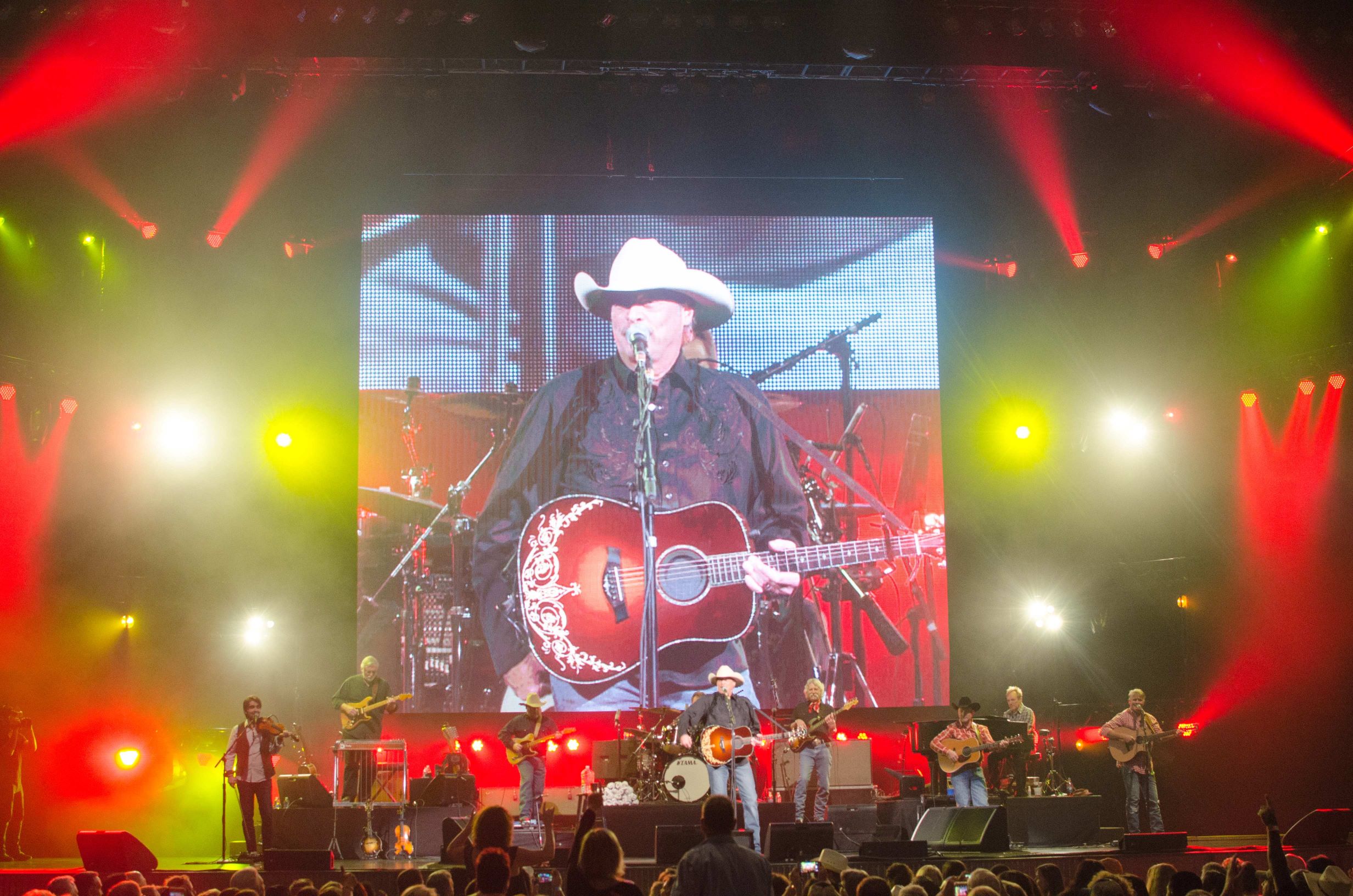
The first consideration when designing with video elements is the physical placement and form factor within the stage space, and avoiding the trap of visual clichés and lazy design. This is a very roundabout way of saying: please, please think carefully before using a straight rectangle in your design. There are a multitude of historical and technical reasons why formatting every video signal in existence as a rectangle makes sense and is done, but this doesn’t mean that the output must always follow that same form factor. I’m going to adopt what a perhaps controversial opinion, and assert that unthinkingly throwing up a 4:3 or 16:9 rectangular screen will never look good. It will look adequate. It will look like a movie theater. As I’ve stated elsewhere, we as lighting designers are purveyors of just one thing: looks. And when a look has been used too often or reflects something that the audience can regularly see in their everyday life, it becomes boring. Movie theaters are a visual medium we’re all familiar with. Most people have a television in their homes. A simple rectangle displaying a simple video file or IMAG presents no novelty, and novelty is what makes a look interesting. To boil it down to something you could fit on a fortune cookie, people get bored with seeing the same things over and over. Give them something different. A rectangular video wall has been overdone almost to the point of parody – certainly we’re to an era where it’s no longer a show of technical achievement to have even the largest rectangular or square walls. It’s almost a requirement these days for there to be a rectangular side screen at concerts for IMAG. We don’t need more squares dominating the stage. Do something with your video besides just a straight square: make it wider, make it taller, break it up into pieces, make the corners round, something other than a TV-looking thing sitting upstage because management wanted to be able to “show the music videos”. Nothing could be more boring than a rectangle, unless you’re designing for a corporate presentation for insurance actuaries. (Disclaimer: I don’t actually know what an insurance actuary does, and I’m sure they’re a fine group of people who contribute to society.) You can have a rectangular virtual surface “within” a larger irregular shape, but just having a regular 4:3 or 16:9 wall as the sole video display surface is almost always boring.

This is not to say that all rectangles are always bad. In fact, they can look very good. The right content can turn a humdrum screen into something that actually pulls a set together. The key word to take away from my assertion is “unthinkingly”. For a straight rectangle – or, really, any other shape you could conceive of – to look good, there must be thought put into the placement, design, content, and of course shape. The takeaway here is not that rectangles are bad, but thinking that a rectangle will somehow magically look amazing just thrown upstage center to “have some video” is folly. Maybe that would have amazed someone in the 70s, but a huge percentage of our intended audience walks around with a tiny video rectangle in their pocket, literally every day. When they come to a show, we should present them with something different.

Other surfaces and shapes are where one can really start the blur the lines between lighting and video. Products light the Ayrton Magic Panel (Most of the products in the Ayrton range, actually, as well as things like the B-Eye from Clay Paky) contain matrices of LED sources that can work to either wash a surface or an actor, but also have included in them pixel-mapping abilities that a designer can use to send actual video signals to the product. Many of these products have very narrow culminating lenses on them, further enhancing their pixel-like look and allowing for some truly creative visuals to be produced. Designing with these sorts of products requires deep attention to detail, and – in my opinion – a well-developed budget. Having one or two of these devices around the stage will simply not realize their full potential; they look the best when they’re in a matrix or group of some sort.

Content is King


Once you decide on a physical layout for the lighting and video elements, the next most important question is what they will be showing. A blog post about video design could (and has) filled volumes of books, and is outside the scope of this article. Instead, I want to hit on some of the basics that we should understand and have in mind when we think about lighting, the relevant issues being color temperature, brightness, pixel mapping, color, and texture.

The content that gets played back on whatever video surfaces are part of the set design can make or break that video element’s contribution to the overall show. We all know that one can get a bunch of stock content from the internet, or get it in large batches from any of the many content houses around the world, but again, the key here is not to just go “This song is red, and kinda fast, so I’ll find a fast red clip and play it back here.” I see this mistake most often on productions that are just starting out with a media server and excited about the possibilities that having tech like that affords them. Having video affords a lot of power from a visual standpoint, but requires thought to get the most out of the potential it represents. To return again to the similarities between lighting and video, remember that video surfaces can display both color and texture; it’s not necessary that they do both at the same time. Think about the interplay between what the lights are doing and what your video surfaces are displaying. Do they complement each other? Or are they fighting for the same “visual space”? This might be desirable at times, other times it can be distracting. Have a clear vision for what a design needs to accomplish with its visual elements, both lighting and video, and don’t make the mistake of just throwing whatever the media server has in it to see what sticks. This is the wrongheaded thinking behind every instance of “visual vomit” you’ve seen.

Related to the above point is color temperature, though it’s not necessary to belabor this point: be aware of color temperature. Most (all?) LED video products use straight RGB LEDs, which tend to have a different color temperature in white than other sources on stage, so be aware of the white points of your various sources.

The final point that I wish to make is about brightness.

For a while there, it appeared as though video would completely overtake lighting on stages. A far cry from the days of three projectors that had to be manually aligned each day on the road, the technology and sophistication to create truly bright – bright enough to be seen in full-on daylight – video screens is now upon us with the force (and power) of a solar prominence. We suddenly have video walls –really, really big walls, with a photonic output quite capable of figuratively crushing any other element on stage save for the brightest and narrowest of moving light beams.

There are many examples of video walls taken to an extreme. Giant squares conveying an almost Soviet-esque oppressiveness on the stage. Too big, too bright, and being run as little more than giant overpowered television monitors. We’ve all seen them.

And this is a shame because, when balanced and working in harmony, video and lighting together can – if one will allow the author the indulgence of overstatement – sublime. As an example, I offer up the design for the Nine Inch Nails Hesitation Marks tour. Here, video and lighting worked so perfectly together that the lines between what was video and what was lighting were beautifully and masterfully blurred, a testament to the prodigious skill of designers LeRoy Bennett and Rob Sheridan.

Just about every creative element can have a place in the right part of a production, even the oversized video wall. There’s something to be said about spectacle as art, and having a massive video screen is no exception. But the key factor that is required is balance. Today’s LED-based video walls are capable of truly stunning amounts of light output. The brightest are practically impossible to look at in open white at full output in a dark venue like an arena. This is neither pleasant to look at or artistic in any reasonable definition of the word. Artistry requires balance, requires a skillful blending of two modalities of visual conveyance so that sometimes one is emphasized, sometimes the other, sometimes both, but one or the other never fighting for dominance. To use an analogy from the world of sound, think of video and lighting as two different channels of a song track. Mixing is the process of not only adjusting the various channels that make up the song so that the listener can hear everything, but emphasizing some instruments in some areas and de-emphasizing them in others. Throughout it all, however, the listener can still pick out the individual components of the whole (if the track is mixed well) and never has to strain to hear one thing over another. In the same way, the brightness of the various elements is of paramount importance when mixing disparate products on a stage. They must be harmonious, or one will stick out like a sore thumb while the other is invisible.

Thankfully, while we as lighting designers often have less control over the brightness of our lights than we would like, we almost universally have more light coming out of video elements than we know what to do with. And in their wisdom, manufacturers almost always provide a way to reduce the overall brightness of a video screen uniformly without changing any other aspect of the signal. My personal preference is for the video – in the sense of real “video”, that is, displaying content that contains recognizable stuff like humans and music videos – to be dynamically controlled throughout the show. Don’t just set it on eighty percent and forget it. There are times when the video is supposed to add to the set without being a distraction. Other times it should blend completely into the background, being just some subtle movement. Still other times, it should pop on and really draw the audience’s eyes to it.

Although it’s easy to focus on the most obvious use of video we see in the world of touring musical acts today – modular LED video screens – projection can also a big part of the scene when it comes to video design of a set. Some of the coolest designs I’ve seen in recent years – I’m thinking specifically of Bon Jovi’s “Because We Can” tour and their projection-mapped Tait-built hexagonal towers of awesome. Video need not be relegated to the world of LED-only fixtures. A proper write-up on projection design, however, could (will?) be its own multi-page post.

Overall, the approach to video that I take is to view it as another facet of lighting. LED surfaces project light, and lighting devices can be pixel-mapped to display video. What we’re talking about when we discuss video and lighting as two separate entities is really just a difference of form factors. A successful combining of the two sources will take into account not just color and content, but a thorough understanding of what one is trying to accomplish.

1: How’s your Latin?

Leave a Reply

Your email address will not be published. Required fields are marked *